Blink

END-TO-END E-COMMERCE SOCIAL MEDIA APPLICATION

An accessible e-commerce social media application that allows for convenience and precise product purchasing.

ROLE

User Research
Visual Design
User Testing
User Accessibility & Experience

TOOLS

Figma + FigJam
Google Forms
Webflow
Zoom

DURATION

3 weeks
(2023)

⸻ Problem

Inconvenience is the biggest reason for cart abandonment which ultimately frustrates customers and results in profit loss for companies.

Users on social media are unable to find the exact products they are interested in. Many end up asking questions in the comments or attempting to find the product on their own by reverse image searching. These obstacles decrease the chance that the interested user will end up purchasing the item. Convenience can make or break the user journey with e-commerce. It is important to work towards building solutions to minimize these problems.

⸻ Solution

Design a social media application that allows for precise product linking embedded right into the platform.

This way, users can find products readily, have access to direct links, and follow their favorite creators. On the other hand, creators can post marketing content, build a community, and share inspiration with their followers. It is in the best interest of the user and the creator to have an application that allows for precise product linking with each piece of content.

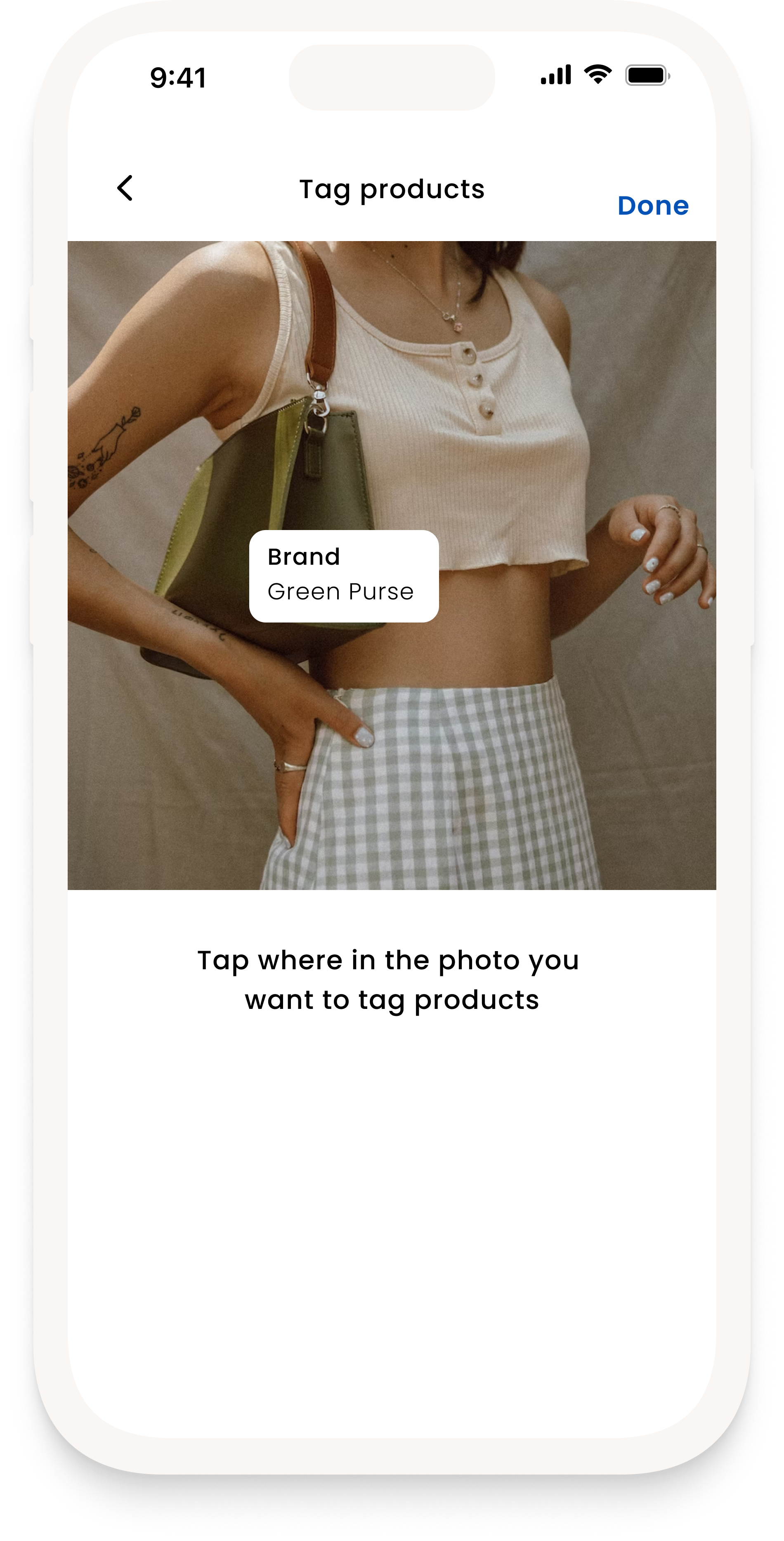
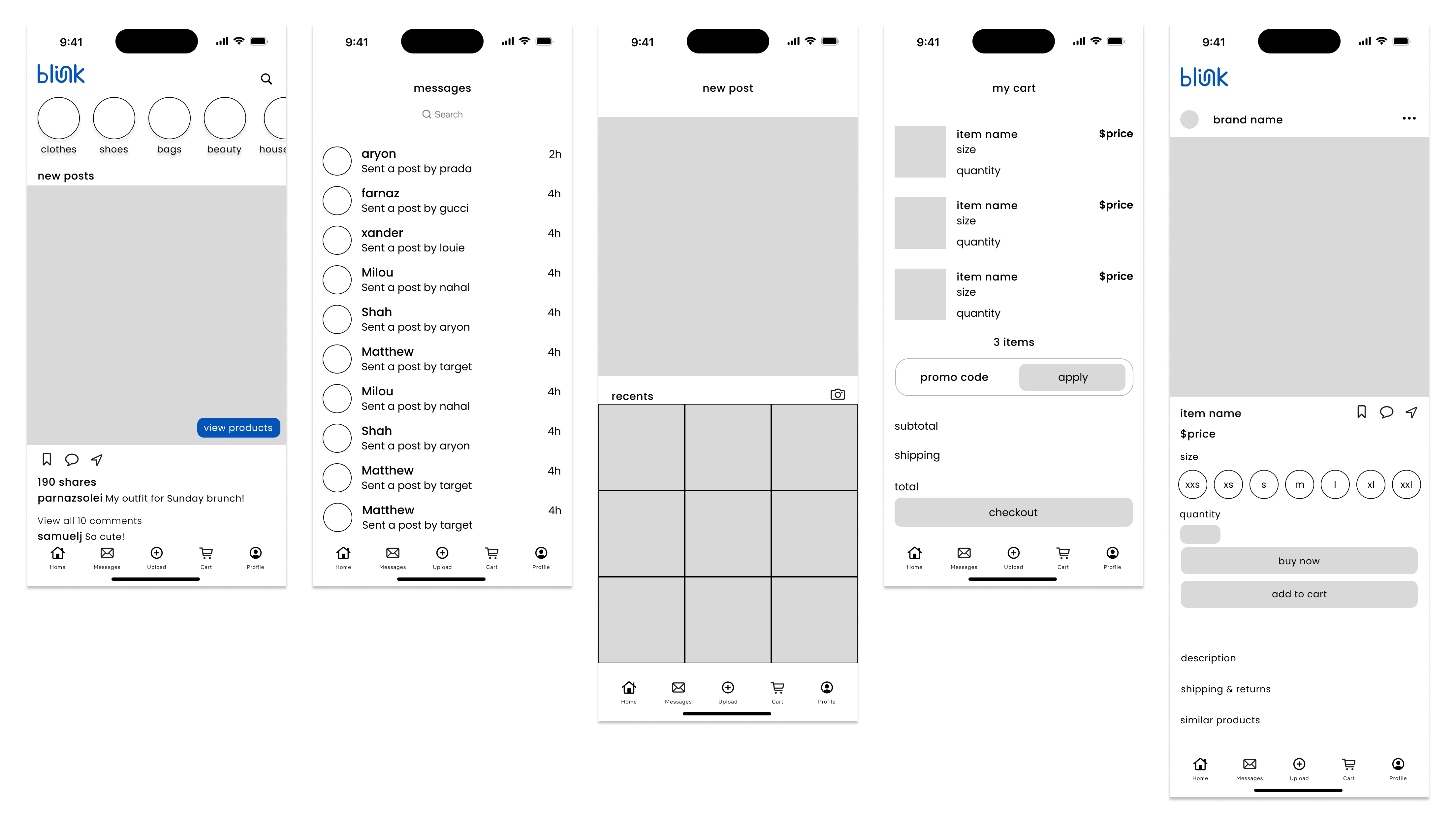
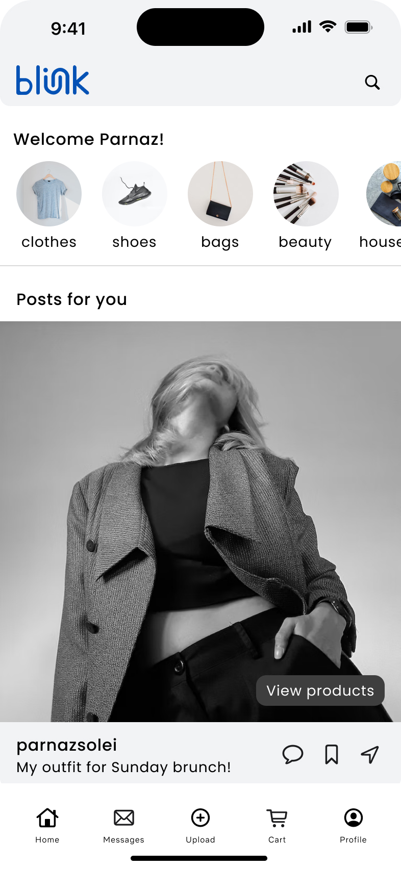
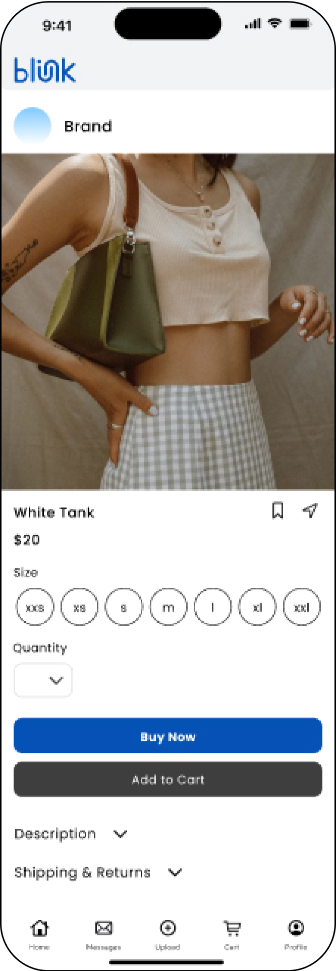
Tag Products directly in Posts

Tag exact products directly in posts. From there, viewers are able to view products and see where to find them.

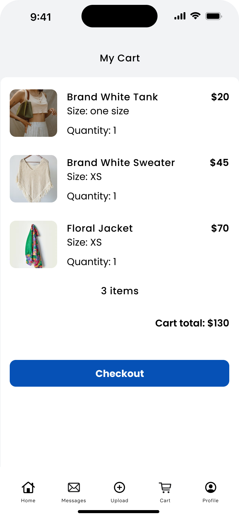
Convenient Purchasing

Purchase directly from the app. With your credit card and shipping information saved with your account, you are able to conveniently purchase the items you are interested in.
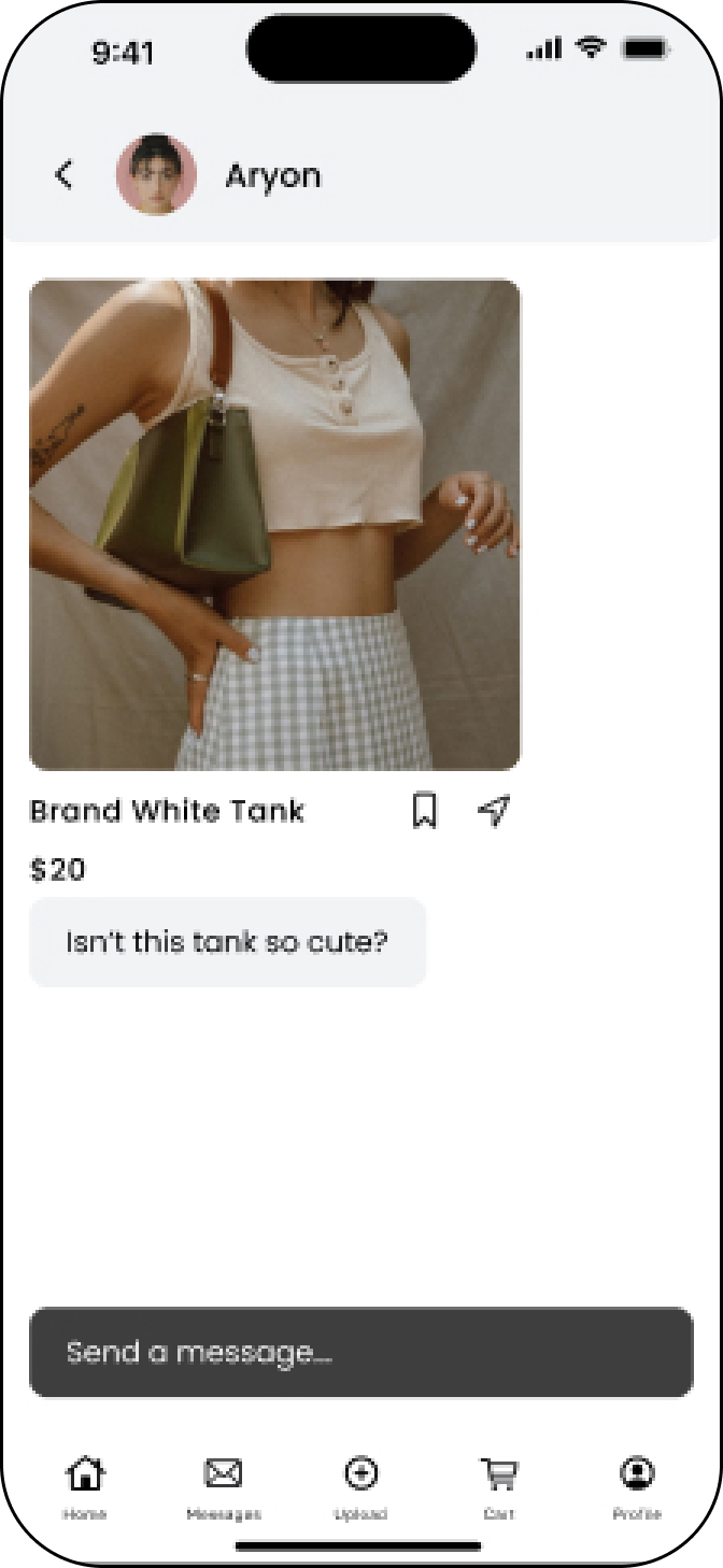
ShareSave products

Add your friends on Blink and share products you like with one another. From there you are able to save them to your favorites or purchase directly.

CLICK TO VIEW PROTOTYPE

⸻ Research Overview

We want to know what problems users face when attempting to purchase products they view in social media content, so that we can find an effective solution to make their shopping experience efficientsuccessful.

In my research, I will be looking into understanding user pain points and needs when it comes to the e-commerce user journey so that we can make the best UI/UX decisions in end-to-end application design.

Before jumping in, I created a Research Plan to organize my process.

METHODOLOGIES:

1. Secondary Research
2. Competitive Analysis
3. User Interviews

ASSUMPTIONS/RISKS:

CLICK TO VIEW FULL RESEARCH PLAN

⸻ Secondary Research

What do I know?

Online shopping is critical for a business looking to grow and it is important for users to have convenient access to products they are interested in. Precise linking of products allows for greater user satisfaction and company success. Convenience means everything in this era of technology where users become easily frustrated with lack of accessibility.

How does competition work in this field?

Competition is intense in the e-commerce industry since millions of companies are in the market trying to gain traction. There are large companies like Amazon and Alibaba that dominate many departments, smaller more specialized companies like Cotton On, and even smaller exclusively online businesses all in the e-commerce industry. Companies are striving to establish a community online because they understand the influence social media marketing has on company’s sales. Ultimately, social media is one of the key drivers behind e-commerce and company success amongst competitors.

Who is the audience?

Individuals who shop online regularly from content they have viewed on social media.

⸻ Competitive Analysis

Competition is tough and it is important to study the landscape to stand out.

There are many e-commerce websites that flood the market. Many of those include CommentSold, Pinterest, LinkTree, etc.

CommentSold

4/5 stars

Focuses on automating administrative tasks and capitalizing on live selling.

Smaller platform that has found success amongst small business owners. Many have complained of software issues and lack of company growth.

Pinterest

4.8/5 stars

A social media platform where users can post, share, and pin their interests.

Seasoned platform that has over 450 million users and has delved into affiliate marketing recently.

LinkTree

4.9/5 stars

A platform that allows users to create a personal page of links for convenience.

Successful platform, but many think it is more effective to have your own website when it comes to website traffic.

⸻ User Research

Diving deeper into the research

In these interviews, my objectives were to:

✦  Understand what users need when trying to purchase a product they like

✦  Understand the process & frustrations behind users trying to find a product based on social media content

✦  Understand what users like about the process of finding products online based on social media content

✦  Understand what users would enjoy on a product-based social media application

✦  Understand what features would be useful on this application

✦  Understand how often users find and want to purchase products they see online

✦  Understand what type of content influences users to buy products online

✦  Understand how much time users spend on social media and how often they see product marketing.

INTERVIEWS:

✦  Remotely on Zoom

✦  4 participants

✦  Age range from 21-46 years old

I went on to synthesize my interview results on an Affinity Map. Here I extracted key details from the user interviews to gain a better understanding of the commonalities and differences between the users to inspire the best design decisions.

Affinity Map:

FINDINGS:

✦ 3/4 users feel that online purchasing process is frustrating due to inability to find exact product, lack of direct links, and forgotten saved products.

✦ 4/4 users think that purchasing process could be improved through direct links, saved shipping & payment information, and having information such as model sizing in the description.

✦ 4/4 users buy products online at least every month and go on social media every day

⸻ Define

The target audience includes users interested in purchasing products they see from their favorite creators, but have found difficulty finding the exact product links.

I synthesized my findings on an empathy map to organize my understanding of the customer.

EMPATHY MAP:

⸻ Personas

Personas highlight the user's goals, pain points, and needs to represent our most important user group.

I noticed I had 2 main target user groups. One one hand I have users who will follow creators to gain inspiration and purchase promoted products. Then on the other hand, I have users who are the main content creators. They will be supplying most of the content on the application.

Let's meet Amanda. She is the common user looking to gain inspiration and follow her favorite creators.

Let's meet Kennedy. She is is our influencer. She creates content regularly and wants to share products with her following.

⸻ Ideate

How do we make Blink's navigation most accessible for users?

✦ Clear bottom navigation with icons

✦ Clear icons, buttons, and links

✦ Visual hierarchy, organization, and a color palette that highlights content

Structure Content

After determining the most important features,  I created a sitemap to define the overall content structure of the Blink application.

Sitemap:

Flows:

I mapped out some flows on how the user would interact with the application based on their goals.

These flows we will later test with participants to confirm our design decisions. The flows go through the key features of the application to confirm the effectiveness of the UI/UX design.

User Flows:

⸻ Wireframes

Setting the foundation

After some sketching, I built Low-Fidelity Wireframes to start getting a grasp on my platform design.

I created 5 key screens. A “Home” page, “Messages” page, “Upload” page, “Cart” page, & a product page.

I took my lo-fi wireframes and flows and created my hi-fi wireframes.

My final designs embodied end-to-end mobile application screens.

I utilized a bright blue as my main brand color, Poppins as my typography of choice, and create a unique Blink logo. It is bright, professional, and clean to highlight the digital content that will be the focus of the application.

⸻ Prototyping

Once my design is finalized, it is now time to prototype my flows so that I can conduct usability testing and make adjustments as necessary.

It came time to testing my design decisions regarding the Blink application.

CLICK TO VIEW PROTOTYPE

⸻ Usability Testing

I conducted timed usability tests with 3 participants who were asked to complete 3 task flows.

TASK FLOWS:

✦ Uploading a post of your own and tagging products in the post.

✦ Purchasing a product from your home feed.

✦ Viewing a product your friend messaged you and “saving” it.

CLICK TO VIEW FULL TESTING PLAN

RESULTS:

SUMMARY:

✦ 3/3 users were successful in completing the tasks

✦ 3/3 tasks were completed under 120 seconds for all users

✦ 3/3 tasks were completed with low severity + low frequency errors

✦ 3/3 overall impressions were positive

FINDINGS:

Prioritizing feedback is crucial, especially since we cannot apply all iterations.

I used a matrix to organize feedback based on what worked, what to change, questions, and ideas to consider for later.

I made notes for what worked, what should be changed, ideas for future iterations, and any questions my users may have had.

⸻ Iterations

2 significant iterations were made after receiving user feedback.

Using the Matrix I created from usability testing I determined the severity and necessity of the changes I could make with my design. It is important to prioritize which changes are most important, since I cannot apply all suggestions.

✦ Users expressed desire to save products from preview versus only being able to save on full product page

✦ To address this I added “save” and “share” icons to the product preview

✦ Users expressed confusion about “comment” icon on product page.

✦ To address this I removed the “comment” icon since it is unnecessary

⸻ Final Design

Guidelines for accessible & consistent UI design throughout platform.

Design systems are necessary for a consistent and accessible user experience. By creating components and a style tile for the platform, users can focus on their tasks rather than trying to figure out the platform design.

Below are some of the components utilized throughout the Blink application.

⸻ Learnings

Convenience is the key driver when it comes to online sales.

The user journey between social media applications and product purchasing can be inconvenient and frustrating. I got to conduct research on user pain points and frustrations when it comes to this exact process. I learned how often products become forgotten due to lost screenshots unorganized saved products. Precise linking allows for greater satisfaction amongst both users and creators.

Apply iterations wisely.

Despite how much feedback and ideas you may receive during usability testing it is important to be selective in the changes you make. A matrix such as the Eisenhower Matrix can help prioritize higher impact items. It is important to note all the ideas for future reference, but it is not necessary especially when executing a minimum viable product.

⸻ Other Projects