Meez
RESPONSIVE WEBSITE REDESIGN
⸻
A responsive website with a focus on new customer acquisition, mobile ordering, and reservations.
ROLE
User Research
Visual Design
User Accessibility & Experience
TOOLS
Figma + FigJam
OptimalWorkshop
Zoom
⸻ Problem
Meez wants to improve its customer experience by redesigning their current website with responsiveness, visual hierarchy, and accessibility in mind.
Meez is a Persian restaurant opening in the heart of Calabasas, CA. Their main clientele includes customers in the greater Los Angeles area. The restaurant is family-owned, excited to serve authentic high-quality Persian food, and is looking to redesign its current site.
Opening a new restaurant in a small town is a very stressful process. Meez has invested heavily into renovations, staff, food, and rent to make sure everything runs to the highest standard. Having a well designed website that fits both Meez & their customer's needs is vital to make sure they open smooth sailing.
⸻ Solution
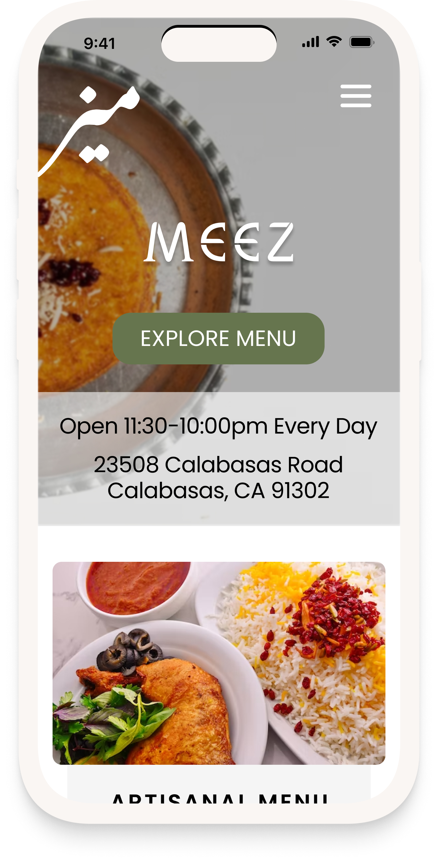
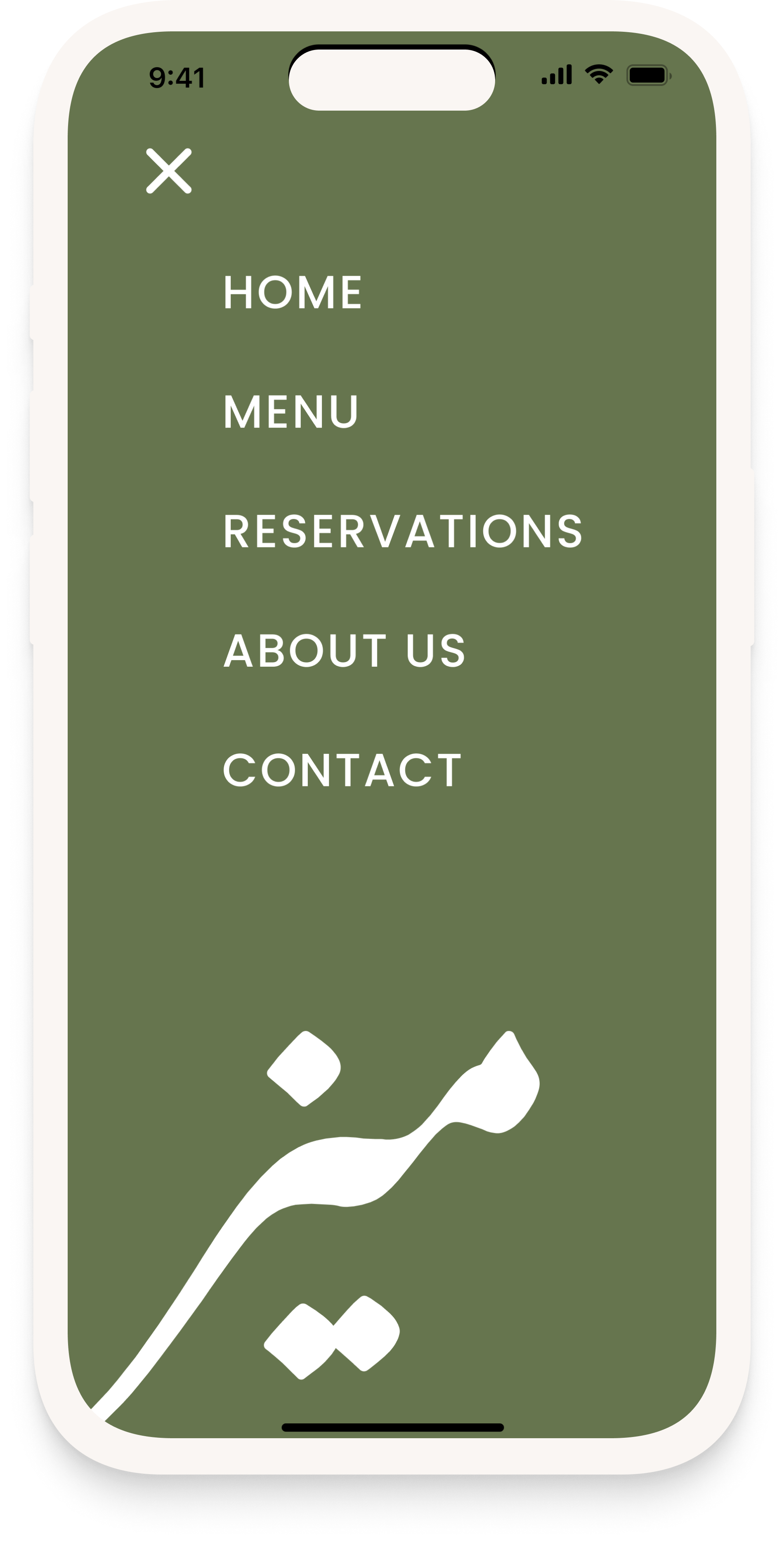
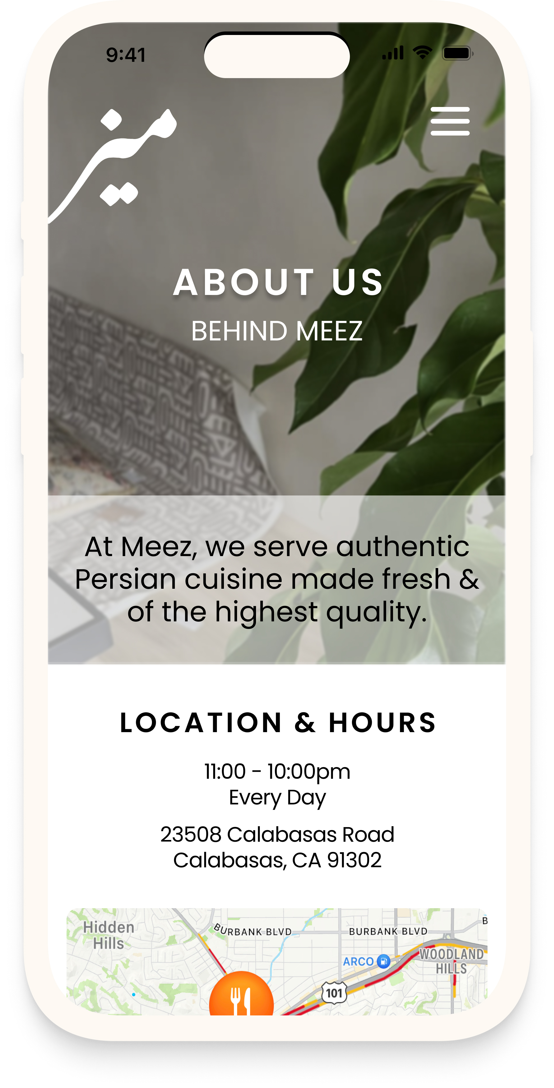
Introducing the new Meez.
This way, customers can find information readily, have access to a digital menu, make reservations on their own, and learn about the family behind the restaurant. A clean and accessible site tells a lot about the service and quality customers will receive when attending the restaurant in person.
Clean & Accessible
The new design is clean & accessible. Users can now find what they are looking for with ease. The new website complements the interior design of the restaurant.
Mobile Responsive
The most important change in this redesign was the mobile responsiveness. Most users look at websites on their mobile device, especially if they are looking to put in an order after a busy day.
Personal Touches
Persian food is rooted deep in its culture. Most Persian restaurants are family owned and serve food made in-house. Adding a personal touch to the website allows users to connect with the restaurant and its owners.
⸻ Original Meez Website
The original site lacks responsive design, proper alignment, & text hierarchy.
The buttons & chosen color palette are inaccessible & hard on the eye. The aesthetics are clean & simple, but there is a lot of room for improvement.
CLICK TO VIEW ORIGINAL WEBSITE⸻ Research Overview
We want to know what users look for when navigating restaurant websites so that we can find an effective solution to make the experience easier.
Restaurant websites can be poorly designed and hard to navigate. Cultural restaurants have unfamiliar dishes and traditional foods that most individuals may not be familiar with.
Before jumping in, I create a research plan to organize my process.
METHODOLOGIES:
1. User Interviews
2. Surveys
3. Competitive Analysis + Secondary Research
PARTICIPANTS:
CLICK TO VIEW FULL RESEARCH PLAN⸻ Secondary Research + Competitive Analysis
Competition is tough in the Los Angeles area amongst Persian restaurants.
Persian restaurants offer high-quality food with top service. Once a Persian restaurant establishes legitimacy, it spreads like wildfire among Persian community members. Competition is tough, but everyone needs their local Persian spot!
Shirin
4/5 stars
2.3 miles away from Meez

UI has a lot of writing, food ordering is on separate domain with a different design.
Kourosh
4.5/5 stars
2.3 miles away from Meez
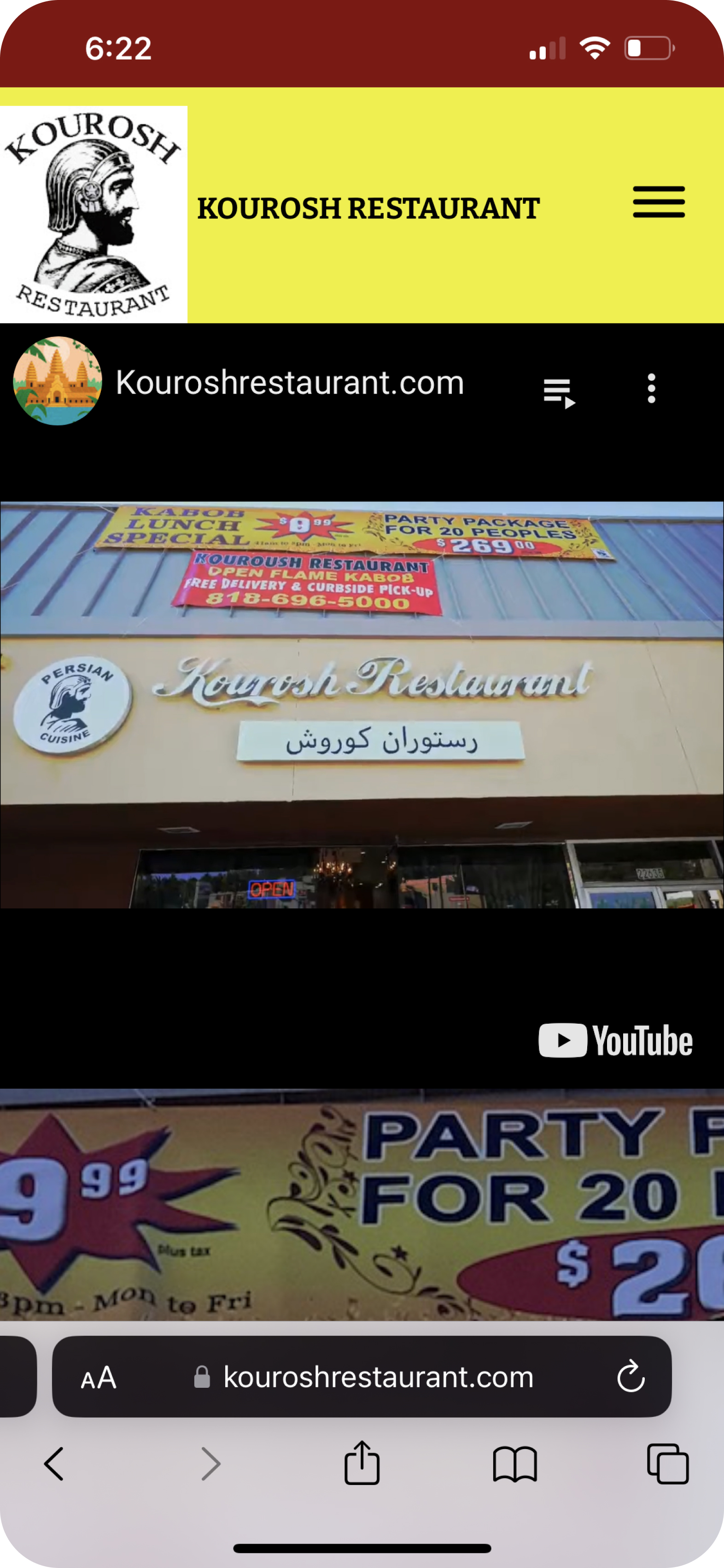
Poor aesthetics/design. Unprofessional images.
Alborz
4/5 stars
1.4 miles away from Meez

Lacks consistent color palette.
Hard to read webpage. Gallery has low-quality images.
⸻ User Research: Meeting with Meez owners
Meez wants a website design that matches their earthy upscale aesthetic & supports their customer's needs.
After meeting with the owners of Meez, we determined that their customer base consists of Los Angeles locals and they are looking to redesign their current site to be responsive and more aesthetically pleasing.
"We want the website to be clean, classy, & smooth."
SUCCESS METRICS:
✦ Their goal is to create a revenue stream that reaches 1.3 million in the first 6 months.
✦ They want to have at least 180 customers a day at an average price of $40 per customer.
✦ They want to have a minimum of 10-20 takeout orders a day.
⸻ Project Goals
Organizing user and business goals to set the foundation for a successful website.
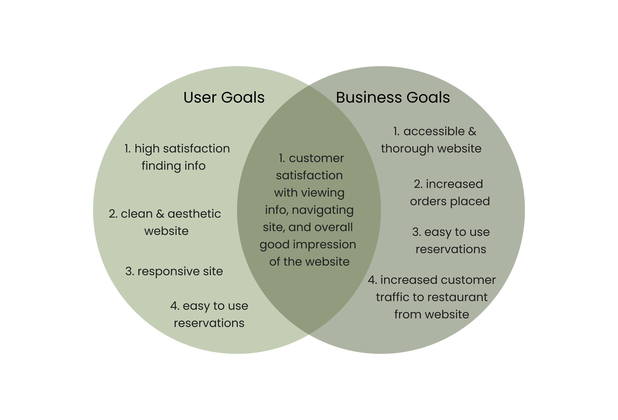
By organizing both business and user goals we see the alignment between customer satisfaction, website success, and a successful result.
⸻ Surveys
Laying out a solid foundation for solutions.
To test my hypothesis and build a better understanding for what customers are looking for, I administered a survey with 30+ responses.
FINDINGS:
✦ Most people got to restaurant website for menu, hours, and contact information.
✦ Most people use Yelp when wanting to find more information.
✦ Individuals mainly hear about new restaurants from social media & word of mouth.
✦ Food & service are the most important things people pay attention to at a restaurant.
✦ Individuals expect a restaurant's website to have pictures, menu, contact information, and reservations.
⸻ Define
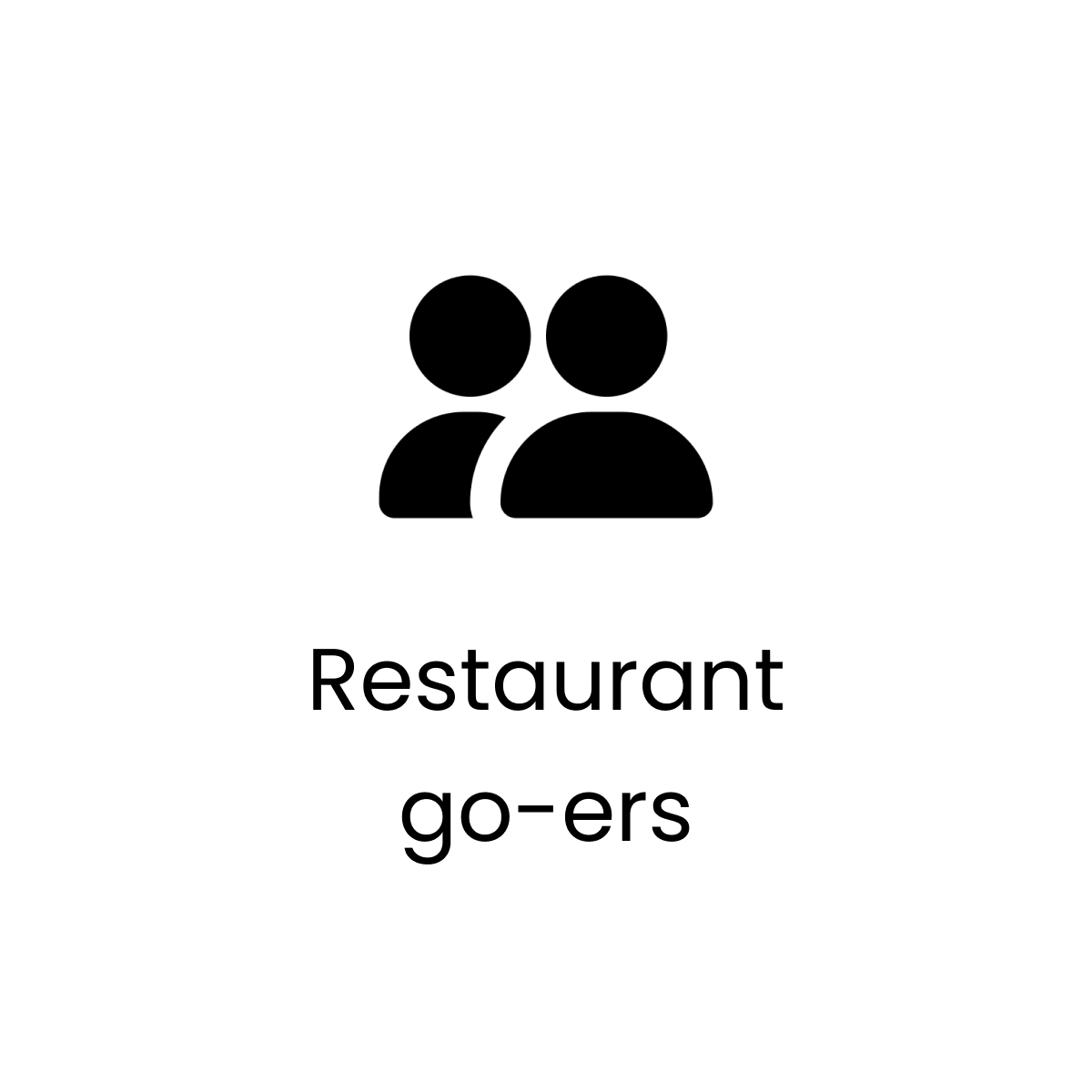
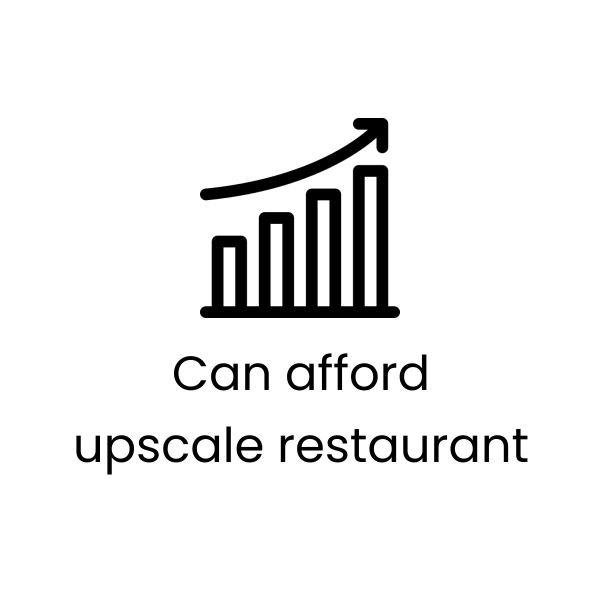
The target audience includes adults living in Los Angeles County that are interested in dining at an upscale restaurant.
I synthesized my findings on an empathy map to better understand the customer.
EMPATHY MAP:

⸻ Personas
Personas highlight the user's goals, pain points, and needs to represent our most important user group.
Let's meet Jane. She is a cultural food enthusiast who wants to have a delicious meal in Los Angeles.
⸻ Ideate
How do we make Meez's website navigation clearer for users?
✦ Easily accessible Menu.
✦ Easily accessible restaurant location, hours & contact information.
✦ Visual hierarchy, organization, and complementary color palette.
Structure Content
After determining the most important features, I created a sitemap to define the overall content structure of the Meez website.
Sitemap:

Flows
I mapped out some flows on how the user would interact with the website based on their goals.
The flows go through the key pages of the website that the owners wanted to make sure to incorporate.
Task Flows:
User Flows:
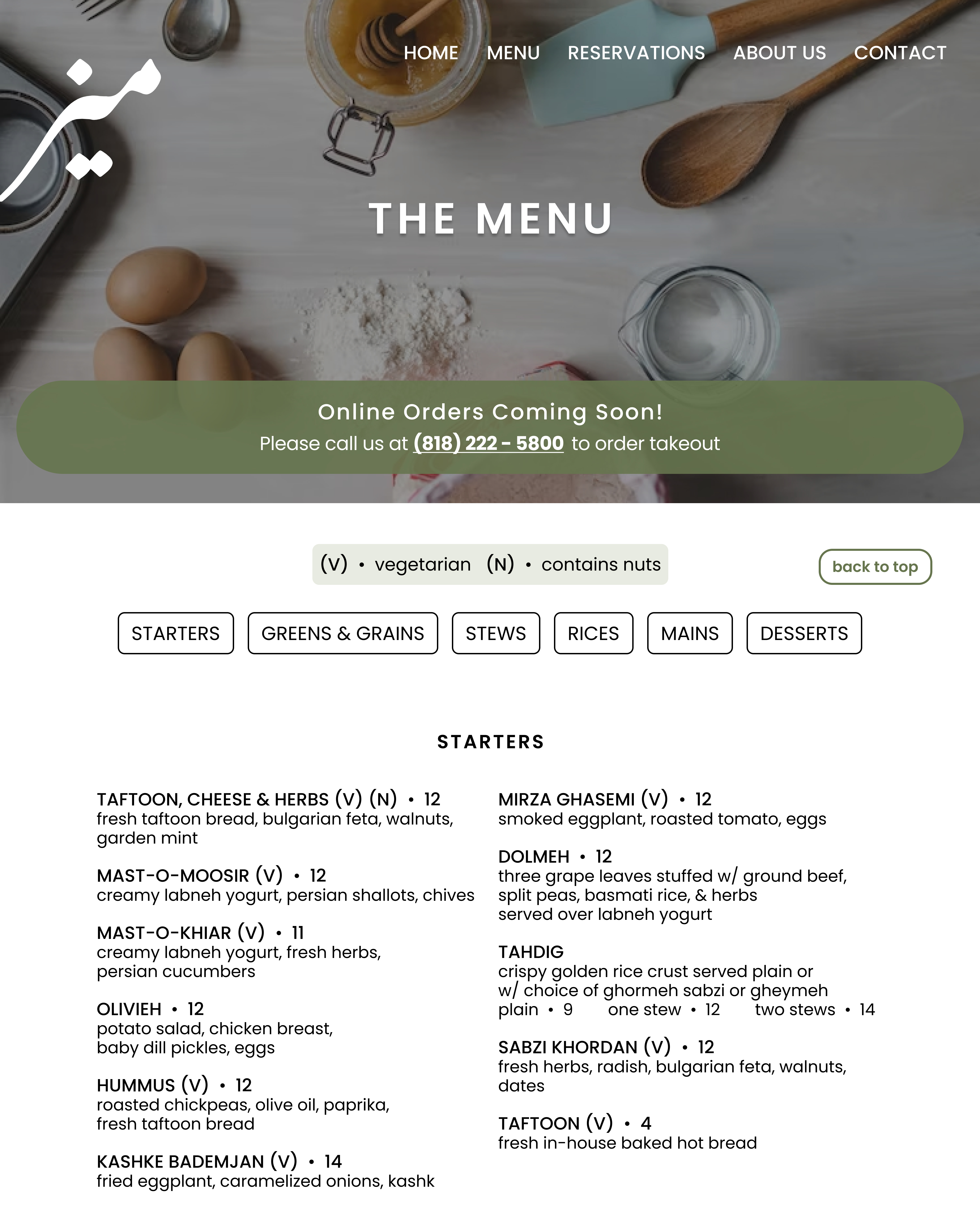
⸻ Wireframes
Setting the foundation
After some sketching, I built low-fidelity wireframes to start getting a grasp on my platform design.
I created 5 key screens; a homepage, menu, reservations, about us, & a contact us page.
I took my lo-fi wireframes and flows and created my hi-fi wireframes.
My final design embodied both mobile and desktop responsive designs.
I utilized an eathy color palette, professional typography, and new logos. It is bright, professional, & clean.
⸻ Prototyping
Once my design is finalized, it is now time to prototype my flows so that I can conduct usability testing and make adjustments as necessary.
CLICK TO VIEW PROTOTYPE⸻ Usability Testing
I conducted timed usability tests with 4 participants who were asked to complete 3 task flows.
TASK FLOWS:
✦ Viewing the menu and finding the "Desserts" section.
✦ Finding Meez contact info and sending an inquiry.
✦ Finding the location & hours.
CLICK TO VIEW FULL TESTING PLANRESULTS:
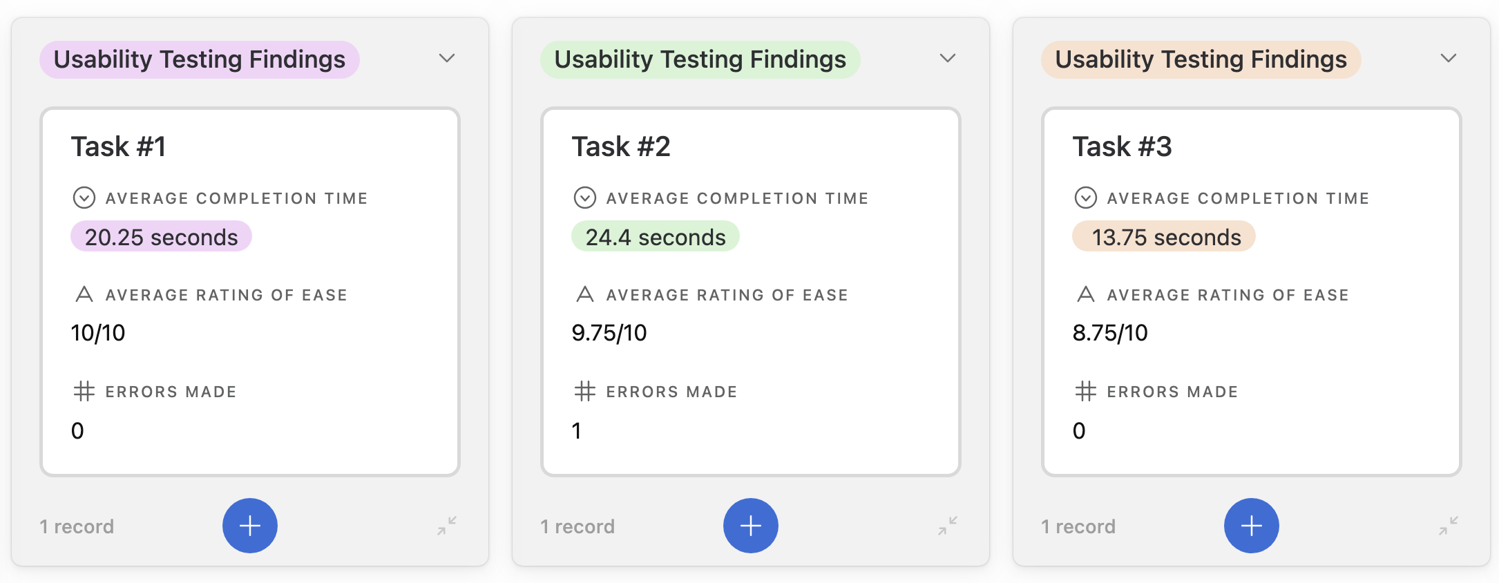
FINDINGS:
Prioritizing feedback is crucial, especially since we cannot apply all iterations.
Using the information I gathered from usability testing, I created a matrix to organize the feedback.
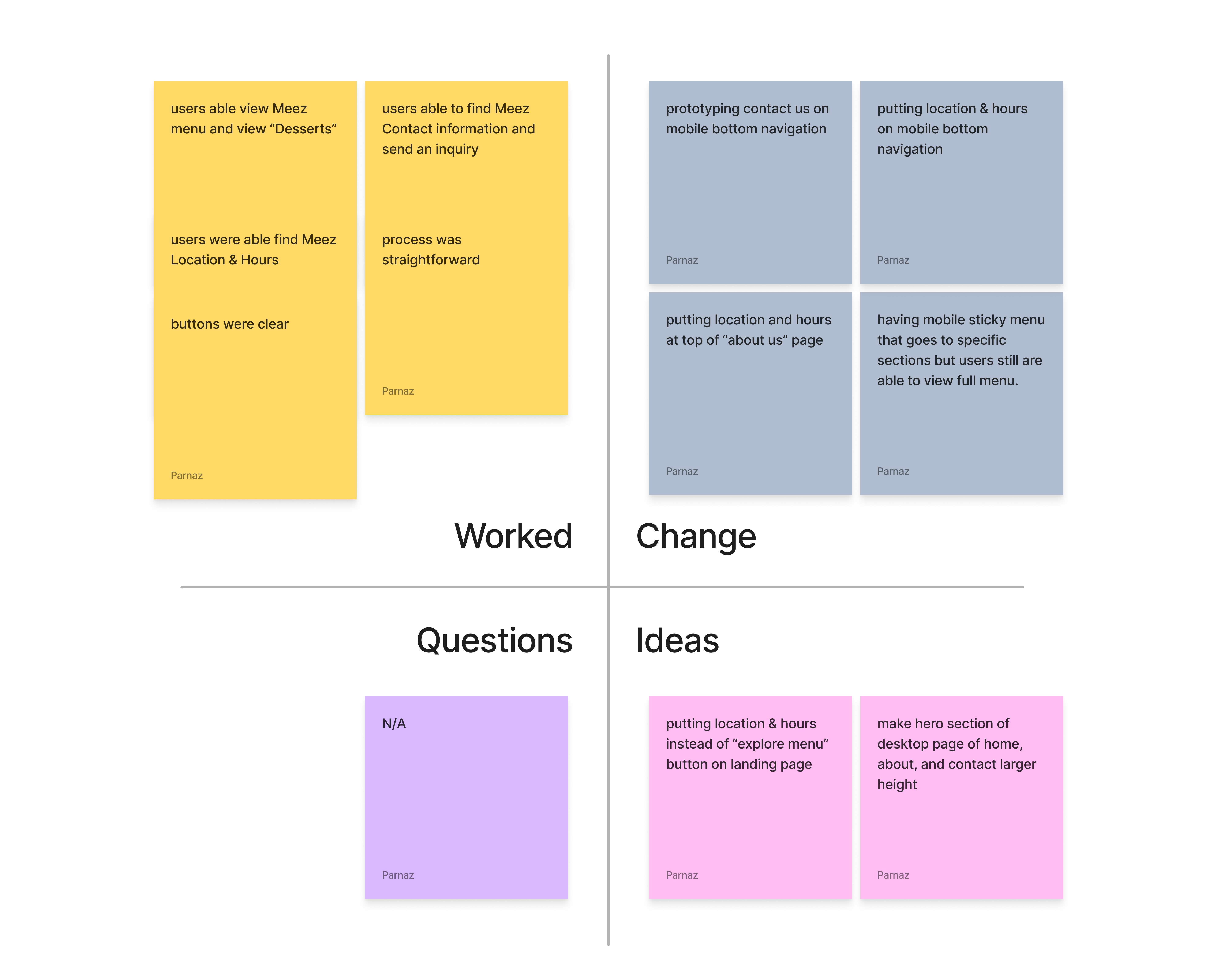
I made notes for what worked, what should be changed, ideas for future iterations, and any questions my users may have had.
⸻ Iterations
3 major iterations were made after receiving user feedback.
Using the Matrix I created from usability testing I determined the severity and necessity of the changes I could make with my design. It is important to prioritize which changes are most important, since I cannot apply all suggestions.
✦ Before:
Users would click on "Contact Us" in bottom navigation hoping to take them to the "Contact Us" page, but it was not prototyped out.
✦ After:
To address this, prototyped the "Contact Us" so that users can access the page from the bottom navigation if they desire to.
✦ Users expressed desire for easier access to “Location & Hours” and felt that it should be more easily accessible.
✦ To address this I brought the “Location & Hours” closer to the top of the page for easier access for those that use the “About Us” page as a source of general information
✦ Users expressed inconvenience when finding “Location & Hours”. Especially in mobile version.
✦ To address this, I added “Location & Hours on the front page for easy access.
⸻ Final Design
Guidelines for accessible & consistent UI design throughout the website.
Design systems are necessary for a consistent and accessible user experience. By creating components and a style tile for the platform, users can focus on their tasks rather than trying to figure out the platform design.
Below are some of the components utilized throughout the Meez website.

⸻ Learnings
Organization is key to design & prototyping.
I learned the importance of organizing Figma layers when it comes to prototyping. I hadn’t realized how important layer names are to how Figma prototypes your design. This would have saved me a lot of trouble regarding prototyping animations. Before this, I had not prototyped to this extent and I will take this lesson with me moving forward.
You can never have too many backup participants for research & testing.
I experienced significant delays in scheduling my usability testing and how important it is to have backups to avoid falling behind schedule. Everyone has their agenda and may not always show up for you despite confirming. This is why it is important to always plan ahead of schedule and have a plan B in circumstances like this.